|
How to Create a .NET Calendar Control (NOMADS) |
Starting with PxPlus 2025, a .NET Interface was added to PxPlus that enables the creation of .NET objects in your application.
For this example, you will be creating a .NET MonthCalendar control in NOMADS. You will be adding various properties, such as color and text, and creating an event when a date is selected using the new interface.
Properties and Event of the .NET MonthCalendar
The .NET MonthCalendar is associated with various properties that allow you to customize its appearance and behavior. For this tutorial, you will be shown just a few of the many possibilities that are available when using properties.
This table lists the properties and the event for the .NET MonthCalendar you will be creating.
|
Object/Property |
Description |
|
BackColor |
Background color of the calendar. |
|
ForeColor |
Color of the calendar dates text. |
|
TitleBackColor |
Background color of the title area of the calendar. |
|
TitleForeColor |
Color of the title and today's date on the calendar. |
|
MaxSelectionCount |
Allows a maximum number of days to be selected at the same time. |
|
Event |
Description |
|
DateSelected |
Sets an event to show a message box when the user selects a date or date range from the calendar. |
These steps show you how to create a new panel and add a .NET MonthCalendar control.
|
1. |
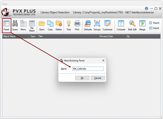
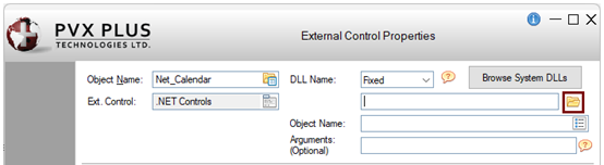
In the Library Object Selection window, launch the NOMADS Panel Designer by clicking the Panel toolbar button or selecting Objects > Panel Object in the menu bar. Enter the name of the new panel. For this example, enter: Net_Calendar Click OK. |
|
2. |
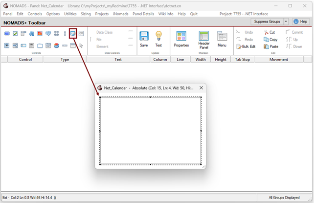
In the NOMADS Panel Designer, select the External Control button on the toolbar. Draw an External Control on the panel so that it is an approximate size suitable for the .NET Calendar control. |
|
3. |
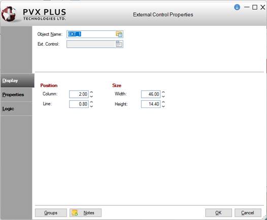
The External Control Properties window is displayed. |
|
4. |
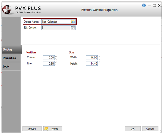
In the Object Name field, enter the control name or object handle. For this example, enter: Net_Calendar |
|
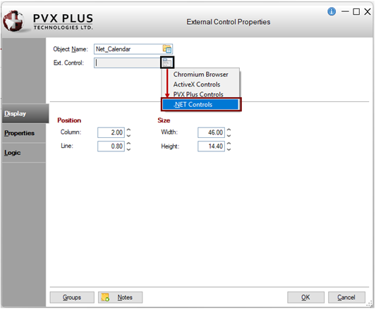
5. |
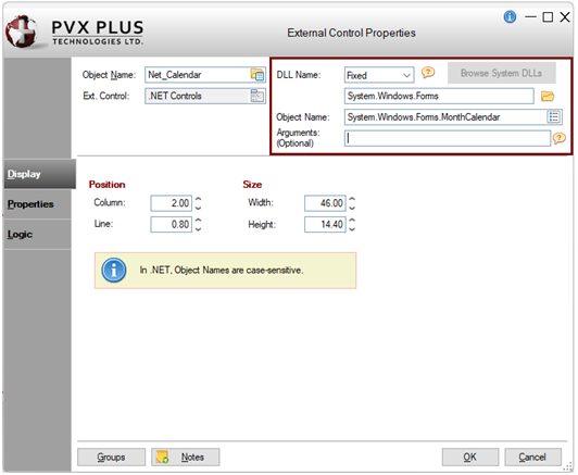
For the Ext. Control field, click the Query button. From the list, select the type of External Control you want to create. For this example, select: .NET Controls |
|
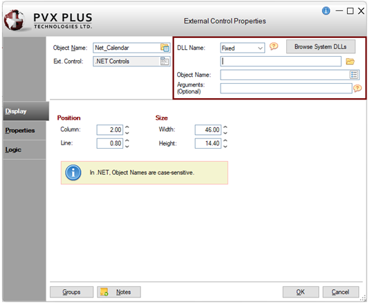
6. |
Additional fields display for specifying a .NET DLL Name, Object Name and any optional Arguments. |
|
7. |
The DLL Name can be defined either as a Fixed value or an Expression. For this example, define it as a fixed value. Leave the DLL Name drop box set to Fixed. The remaining fields will be completed later. To define the DLL Name as an expression, you would change the DLL Name drop box to Expression and then enter the expression in the input field. The expression must evaluate to the correct value while in the NOMADS Panel Designer. |
|
8. |
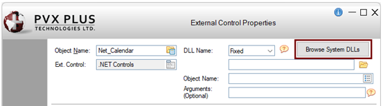
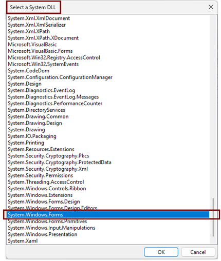
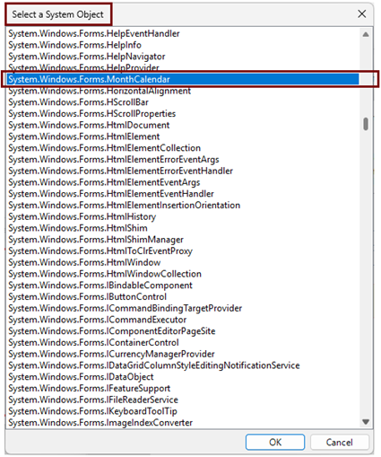
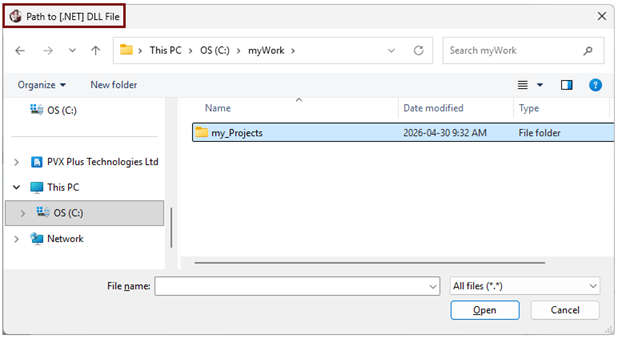
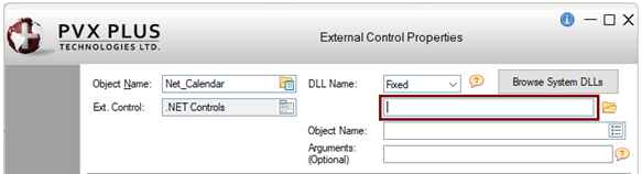
To define the DLL Name as a fixed value, three methods are available. For this example, use Method 1. Method 1: Click the Browse System DLLs button. If the button is disabled, make sure that the DLL Name drop box is set to Fixed and the DLL Name input field is empty. The Select a System DLL window is displayed. Select a system DLL from the list. For this example, select System.Windows.Forms. Click OK. The Select a System Object window is displayed automatically. Select a system Object from the list. For this example, select System.Windows.Forms.MonthCalendar. Click OK. To continue with this example, go to Step 9. OR Method 2: Click the Browse button (yellow folder icon) beside the input field to specify the location of the .dll file. The DLL Name does not require the .dll extension. The Path to [.NET] DLL File window is displayed, allowing you to browse to or enter the path to the .dll file. OR Method 3: Enter the name of the .NET DLL directly in the DLL Name input field.
|
|
9. |
In the External Control Properties window, the DLL Name and Object Name fields should now be populated, and the Browse System DLLs button should be disabled. This example demonstrates how the Browse System DLLs button (Method 1) simplifies the selection of a system DLL and its associated object. With Method 2 or Method 3, the Object Name must be specified separately, either by clicking the Object Name lookup button or entering the Object Name directly in the Object Name input field. Note: |
|
10. |
You can optionally pass in arguments when creating .NET objects. These arguments can be strings, numbers, or .NET object handles. See PvxHandle$. Multiple numeric or string arguments can be specified and must be separated by commas. For this example, leave the Arguments field blank. |
|
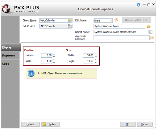
11. |
You can optionally adjust the calendar's Position and Size coordinates. For this example, enter the following values: Column = 3.00 |
|
12. |
Click OK to save the changes and exit the External Control Properties window. |
|
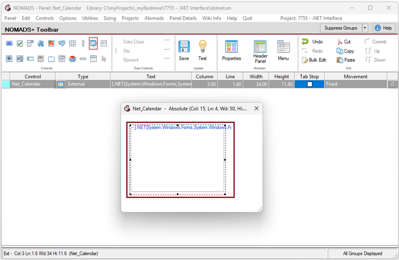
13. |
In the NOMADS Panel Designer, the .NET calendar control is displayed on the panel. |
|
14. |
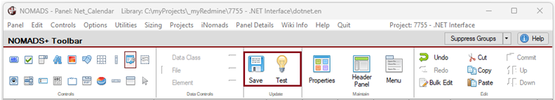
Save and test the panel by clicking the Save and Test buttons on the toolbar. |
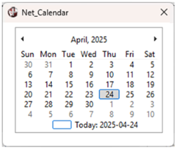
|
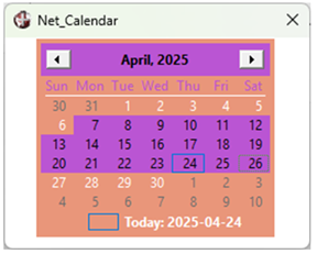
15. |
The .NET calendar will look similar to the one below: |
These steps show you how to set up a default program for the .NET MonthCalendar control in the header Panel Definition window.
|
1. |
In the NOMADS Panel Designer, click the Header Panel option on the toolbar or select Panel > Header from the menu bar. |
|
2. |
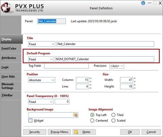
To define the appearance of the control, you will need to create a default program with some logic. This logic will be additional objects or variables that are needed for the properties you will be using in the NOMADS panel. In the header Panel Definition window, click the Display tab. Enter the name of the Default Program. For this example, enter: NOM_DOTNET_Calendar |
|
3. |
Leave the header Panel Definition window open, as you will enter additional settings later. |
These steps show you how to set the color for the .NET MonthCalendar control.
|
1. |
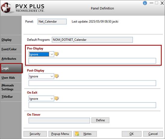
In the header Panel Definition window, click the Logic tab. In the Pre-Display section, you will define a method to be performed prior to the panel being displayed. |
|
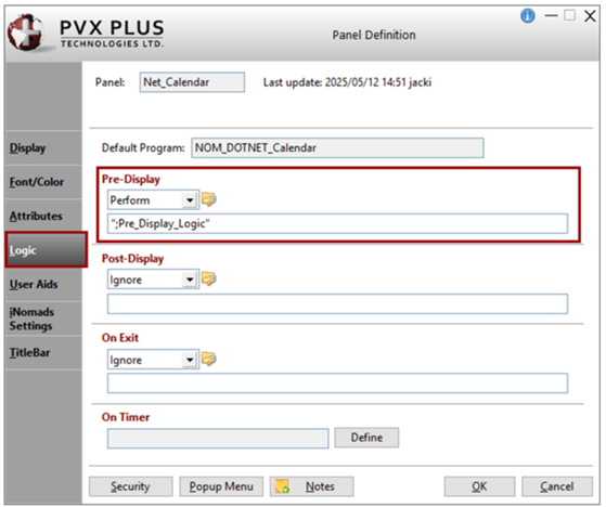
2. |
Select Perform from the drop box. Create a method called: ";Pre_Display_Logic" This method will include the logic where other necessary .NET objects and variables will be defined. |
|
3. |
Click the Program Logic button to the right of the drop box. The default PxPlus program editor will launch and will have created the method. In the header Panel Definition window, click OK to accept the changes and exit the panel definition. Keep the program editor open as you will be adding to the program later. |
|
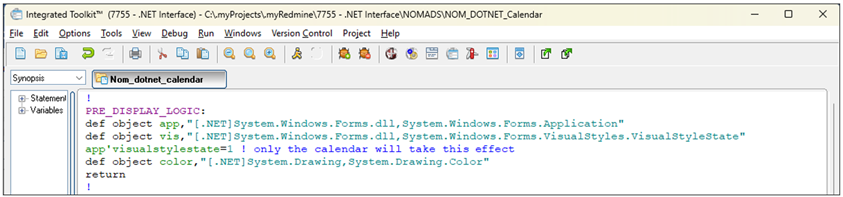
4. |
To customize the appearance, create three additional objects and insert the three lines shown below. Object 1: The Application object has methods to start and stop applications and threads, and to process Windows messages. It allows access to the VisualStyleState object below. Insert the following line and save the program: def object app,"[.NET]System.Windows.Forms,System.Windows.Forms.Application" Object 2: The VisualStyleState object specifies how visual styles are applied to the current application. The property needed for the calendar style will also be needed in the program. For this example, you will only apply visual styles to the calendar (nonclient area); otherwise, this property will affect all windows controls. Insert the following two lines and save the program: def object vis,"[.NET]System.Windows.Forms,System.Windows.Forms.VisualStyles.VisualStyleState" Object 3: For this example, create a new object for Color. Insert the following line and save the program: def object color,"[.NET]System.Drawing,System.Drawing.Color" This screenshot shows the new lines you have inserted: |
|
5. |
Save the program in the editor if you have not already done this. |
|
6. |
In the NOMADS Panel Designer, double click on the .NET MonthCalendar control on the panel to invoke the External Control Properties window. |
|
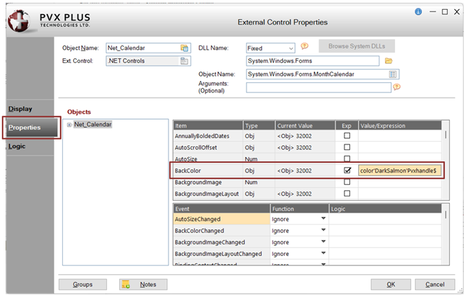
7. |
In the External Control Properties window, click the Properties tab. In the first grid, look for BackColor in the Item column. For this example, set the color DarkSalmon. Select the Exp check box and enter the Value/Expression: color'DarkSalmon'Pvxhandle$ Click OK. |
|
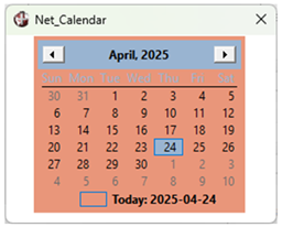
8. |
Save and test the panel. The .NET calendar will look similar to the one below: |
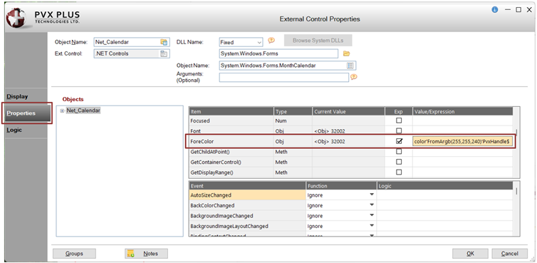
When setting colors, you also have the option to use RGB colors.
For this example, the steps below show you how to set the color for the calendar dates text using the RGB code for the color Ivory, which is RGB: 255 255 240.
|
1. |
In the External Control Properties window, click the Properties tab. In the first grid, look for ForeColor in the Item column. Select the Exp check box and enter the Value/Expression: color'FromArgb(255,255,240)'Pvxhandle$ Click OK. |
|
2. |
Save and test the panel. The calendar will look similar to the one below: |
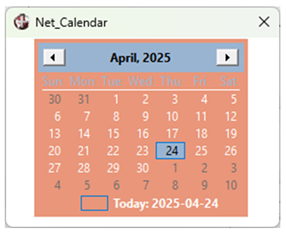
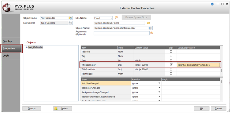
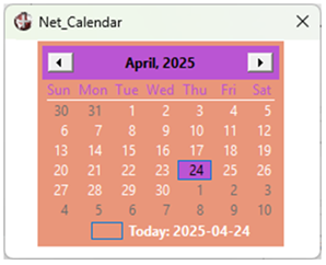
These steps show you how to change the background color of the calendar header.
|
1. |
In the External Control Properties window, click the Properties tab. In the first grid, look for TitleBackColor in the Item column. For this example, set the color MediumOrchid. Select the Exp check box and enter the Value/Expression: color'MediumOrchid'Pvxhandle$ Click OK. |
|
2. |
Save and test the panel. The .NET calendar will look similar to the one below: |
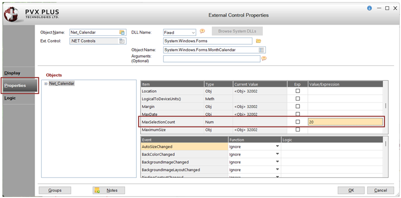
These steps show you how to set the maximum number of days that can be selected.
|
1. |
In the External Control Properties window, click the Properties tab. In the first grid, look for MaxSelectionCount in the Item column. For this example, enter the Value/Expression: 20 (Entering a value of 20 will allow the user to select 20 days as the date range.) Click OK. |
|
2. |
Save and test the panel. The calendar will look similar to the one below where a maximum of 20 days can be selected. |
These steps show you how to set an event to show a message box when the user selects a date or date range from the calendar, and then display the date or dates selected in the multi-line fields.
For this example, the DateSelected event will be triggered when the user selects a date or date range.
|
1. |
In the NOMADS Panel Designer, double click on the .NET MonthCalendar control on the panel to invoke the External Control Properties window. |
|
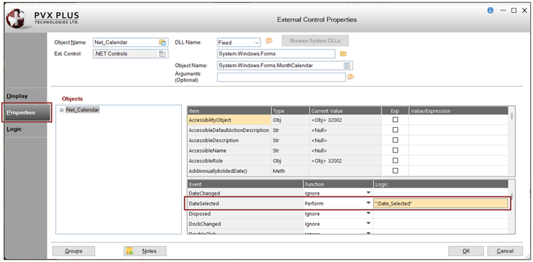
2. |
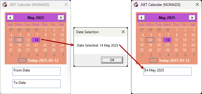
In the External Control Properties window, click the Properties tab. In the second grid, look for DateSelected in the Event column. In the Function column, select Perform from the drop box. In the Logic cell, enter: ";Date_Selected" |
|
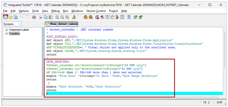
3. |
Return to the program editor and load the default program, NOM_DOTNET_Calendar, which you created earlier. Insert this method and save the program: Date_Selected: |
|
4. |
Click OK to save the changes and exit the External Control Properties window. |
|
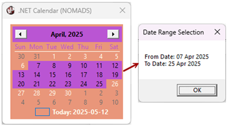
5. |
Save and test the panel. The .NET Calendar will look similar to the one below. Selecting a date range will result in the message box displaying the date range selected. |
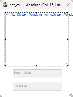
These steps show you how to display the selected dates in "From Date" and "To Date" multi-line fields.
For this example, create these two fields and add them below the .NET MonthCalendar control.
|
1. |
Expand the height of the Net_Calendar panel so that you have enough space to add the two multi-line fields (as shown below). |
|
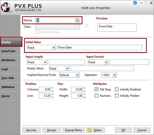
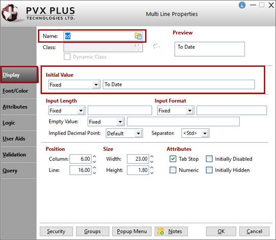
2. |
Create two multi-line fields with the following details: For the name of the first multi-line, enter: fd (stands for From Date). For the Initial Value, enter: From Date Click OK. For the name of the second multi-line, enter: td (stands for To Date). For the Initial Value, enter: To Date Click OK. |
How to Set Up the Attributes for the Panel Header
These steps show you how to set up attributes for the panel header:
|
1. |
In the NOMADS Panel Designer, open the header Panel Definition window. |
|
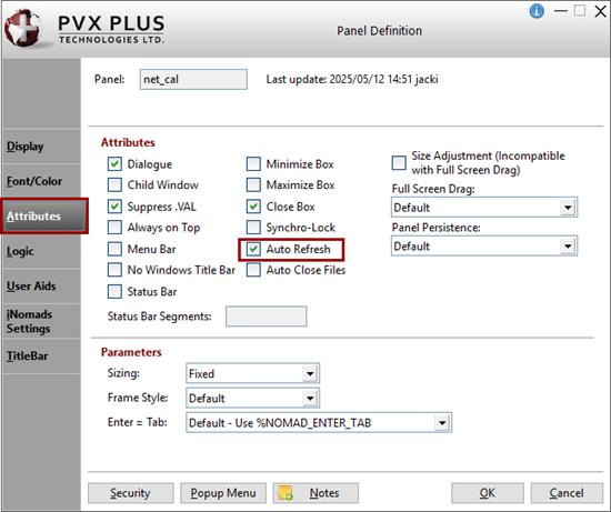
2. |
In the Panel Definition window, click the Attributes tab. |
|
3. |
Select the Auto Refresh check box. By setting this option, changes to the fd$ or td$ values will automatically be displayed on the panel without setting REFRESH_FLG=1. |
|
4. |
Click OK to save these changes and exit the Panel Definition window. |
How to Show/Hide the Multi-Line with a Dependency
For this example, define a dependency so that when the user selects a range of dates, those dates will show in the multi-line controls. But when the user selects only one date, then only one multi-line will show.
|
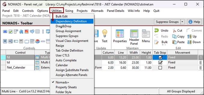
1. |
In the NOMADS Panel Designer, select Utilities > Dependency Definition from the menu bar. |
|
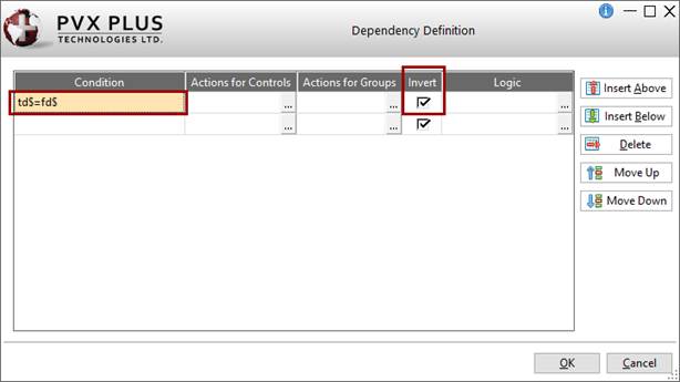
2. |
The Dependency Definition window is displayed. In the Condition cell, enter: td$=fd$ The Invert check box is automatically selected. Leave this selected to ensure the opposite logic when the condition is false. |
|
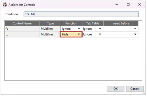
3. |
Click the ellipsis button (three dots) in the Actions for Controls cell. The Actions for Controls window is displayed, showing the two control names. In the Function column, leave the fd control set to Ignore. For the td control, select Hide from the drop down list. |
|
4. |
Click OK to accept these selections and exit the Actions for Controls window. |
|
5. |
You are returned to the Dependency Definition window. Click OK again. |
|
6. |
Save and test the panel. |
|
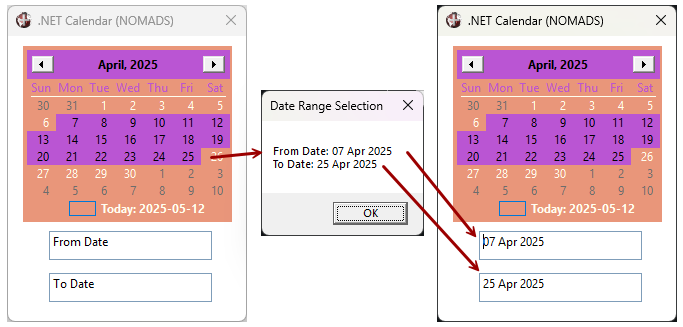
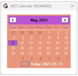
7. |
This first example shows selecting a date range results in the message box displaying the From/To dates selected. The From Date and To Date fields are populated with these dates. This next example shows that selecting a single date results in the message box displaying the date selected, and the To Date field is hidden, since only one date was selected.
|
These steps show you how to clean up any objects that were defined.
|
1. |
From the NOMADS Panel Designer, invoke the header Panel Definition window for the Net_Calendar panel by clicking the Header Panel option on the toolbar or selecting Panel > Header from the menu bar. |
|
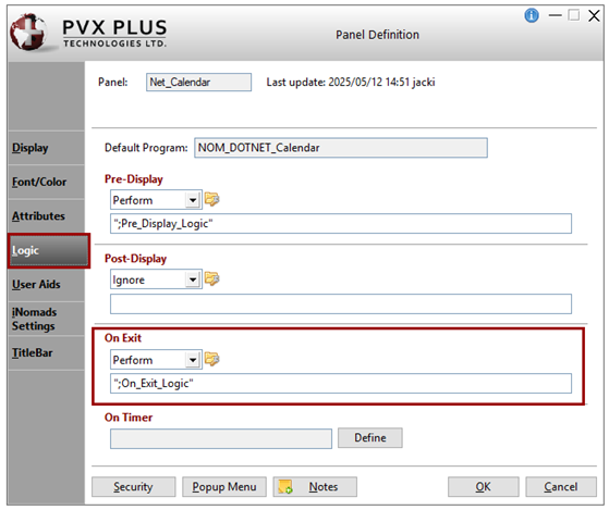
2. |
In the Panel Definition window, click the Logic tab. You will be using the On Exit section to perform the cleanup of any objects defined. |
|
3. |
In the On Exit section, select Perform from the drop box. Create a method called: ";On_Exit_Logic" This will perform the method where all the objects will be dropped. |
|
4. |
If the program is not already loaded in the editor, click the Program Logic button to the right of the drop box to load the default program NOM_DOTNET_Calendar. Insert this method and save the program: On_Exit_Logic: |
After completing this tutorial example, you should have a working program similar to the one below:
! dotnet_calendar - .NET calendar nomads
!
Post_Display_Logic:
def object APP,"[.NET]System.Windows.Forms,System.Windows.Forms.Application"
def object VIS,"[.NET]System.Windows.Forms,System.Windows.Forms.VisualStyles.VisualStyleState"
APP'VISUALSTYLESTATE=1 ! Visual styles are applied only to the nonclient area.
def object COLOR,"[.NET]System.Drawing,System.Drawing.Color"
return
!
Date_Selected:
fd$=net_calendar.ctl'selectionstart'toString$("dd MMM yyyy")
td$=net_calendar.ctl'selectionend'toString$("dd MMM yyyy")
if fd$<>td$ then {! fd$>td$ more than 1 date was selected
msgbox "From Date: "+fd$+sep+"To Date: "+td$,"Date Range Selection"
return
}
msgbox "Date Selected: "+fd$,"Date Selection"
return
!
On_Exit_Logic:
drop object COLOR,err=*next
drop object APP,err=*next
drop object VIS,err=*next
drop object DATESELECTED,err=*next
drop object NET_CALENDAR,err=*next
!
end
!
.NET Interface
How To Tutorials (for .NET Interface)
DEF OBJECT Define Windows Object
ON EVENT Event Processing